The Ultimate Guide to Email Design Best Practices to Stand Out

Email design plays an effective role to increase click-throughs, boost conversions and reach your target audience. Learn more
Email Design Best Practices | What Is Email Design?
When it comes to email marketing, you can have the best strategies in place and still see no return on your time or money if your email design sucks. Why? Because not only does email design affect whether or not people open your emails, but it also affects how they feel about your brand when they see it in their inboxes.
Email design is a strategy developed based on your target audience for your subscribed customers. An appealing email design gets the word to the subscribers as quickly as possible. The email’s content conveys important information. However, the email’s design draws the reader’s attention as soon as they open it, encouraging them to read the entire message and lowering the bounce rate.
6 Best Email Design Practices You Should Know
Email design is important because it can actually help you engage with the recipients. In addition to that, using email design best practices can help you avoid the spam folder. Here are 6 email design best practices you should know.
Use Sender Name
The sender name is one of the most important best practices for email design. It’s the first thing recipients see when they open your email, so making a good impression is important. There are a few things to keep in mind when choosing a sender name:
1. Keep it short and sweet,
2. Use personalization, and
3. Make sure it’s consistent with the From name in your email header.
Following these best practices will help ensure that your emails stand out in recipients’ inboxes and get opened and read.
Craft a Killer Subject Line
Your subject line is your first (and sometimes only) chance to make a good impression on your subscribers. So, it’s important to take the time to craft a killer subject line that will entice people to open your email.
To craft an effective subject line, a sender should use a short sentence that contains all the detailed information mentioned in the email. The email should add value for the reader to get it opened. Make it mobile-friendly and also add some humor to it.
Preheader Text
The preheader text is the best way to let your subscribers know what the email is about. It’s a short preview of the email’s content, similar to the meta description. The preheader text should be clear, concise, and to the point. Each email you send out should have its own unique preheader text that can grab people’s attention and make them want to read more.
Use Visual Content Where They Add Value
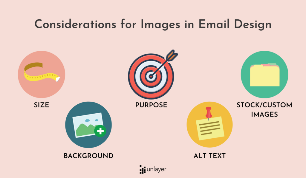
In email marketing, best practices for email design include using visual content where it adds value. This means creating graphics relevant to the email’s topic and helpful to the reader. Additionally, email design best practices include using images that are clear and easy to understand, as well as keeping the overall design simple and organized. By following these best practices for email design, you can create emails that are both visually appealing and effective in driving conversions.
Keep Your Email On-brand
A good email design should be on-brand, meaning it should match the look and feel of your website and other marketing materials. This helps create a cohesive experience for your customers and keeps your brand top-of-mind. Plus, using consistent branding across all channels can help increase brand recognition and recall.
Optimize Your CTAs
Your email’s call-to-action (CTA) is one of the most important elements in your email marketing campaigns. A CTA is what you want your subscribers to do after reading your email, such as visiting your website, making a purchase, or signing up for a service. Optimizing your CTAs will help increase engagement and conversion rates by making it easy for people to take action from their inboxes.
The best email design practices are ensuring that CTAs are large enough to be seen easily on mobile devices and adding text links for those who have disabled images in their emails. It’s also good practice to create CTAs that are relevant to each individual campaign, so consider including things like free shipping on orders over $50 during the holiday season if that fits with your campaign goals.
Summing it all up
An email should summarize the entire email in a simplified manner. It is essential to present the important key points briefly. Links should be included to direct readers to additional resources. The email should have a call-to-action that encourages the reader to take some kind of action. There are 3 techniques to summarize, and those are:
1. Selection – In this technique, you select a few keywords, phrases, or special terms in the article.
2. Rejection – Avoid the usage of repetitions, examples, statistics, and lengthy sentences.
3. Substitution – Combine two sentences, replace one with a simpler sentence, and shorten the sentences.
Frequently Asked Questions
What makes a great email design?
First, your email design should be mobile-friendly. Second, use images and videos sparingly, as too many can make your email seem cluttered. Finally, follow best email design practices to ensure your emails are easy to read and look professional.
What should be included in an email design?
Your email design should include a header, body, and footer. The header should include the sender’s name and address (company name), as well as the date and subject of the email.